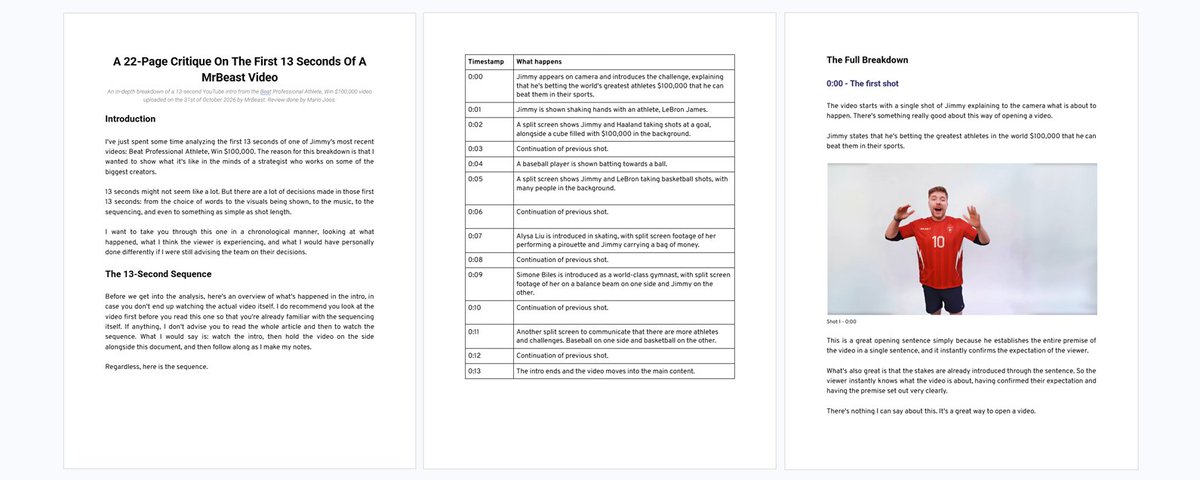
A 22-Page Breakdown On The First 13 Seconds Of A MrBeast Video
文章目录
Introduction
I've just spent some time analyzing the first 13 seconds of one of Jimmy's most recent videos: Beat Professional Athlete, Win $100,000. The reason for this breakdown is that I wanted to show what it's like in the minds of a strategist who works on some of the biggest creators.
13 seconds might not seem like a lot. But there are a lot of decisions made in those first 13 seconds: from the choice of words to the visuals being shown, to the music, to the sequencing, and even to something as simple as shot length.
I want to take you through this one in a chronological manner, looking at what happened, what I think the viewer is experiencing, and what I would have personally done differently if I were still advising the team on their decisions.
The 13-Second Sequence
Before we get into the analysis, here's an overview of what's happened in the intro, in case you don't end up watching the actual video itself. I do recommend you look at the video first before you read this one so that you're already familiar with the sequencing itself. If anything, I don't advise you to read the whole article and then to watch the sequence. What I would say is: watch the intro, then hold the video on the side alongside this document, and then follow along as I make my notes.
Regardless, here is the sequence.
| Timestamp | What happens |
|---|---|
| 0:00 | Jimmy appears on camera and introduces the challenge, explaining that he's betting the world's greatest athletes $100,000 that he can beat them in their sports. |
| 0:01 | Jimmy is shown shaking hands with an athlete, LeBron James. |
| 0:02 | A split screen shows Jimmy and Haaland taking shots at a goal, alongside a cube filled with $100,000 in the background. |
| 0:03 | Continuation of previous shot. |
| 0:04 | A baseball player is shown batting towards a ball. |
| 0:05 | A split screen shows Jimmy and LeBron taking basketball shots, with many people in the background. |
| 0:06 | Continuation of previous shot. |
| 0:07 | Alysa Liu is introduced in skating, with split screen footage of her performing a pirouette and Jimmy carrying a bag of money. |
| 0:08 | Continuation of previous shot. |
| 0:09 | Simone Biles is introduced as a world-class gymnast, with split screen footage of her on a balance beam on one side and Jimmy on the other. |
| 0:10 | Continuation of previous shot. |
| 0:11 | Another split screen to communicate that there are more athletes and challenges. Baseball on one side and basketball on the other. |
| 0:12 | Continuation of previous shot. |
| 0:13 | The intro ends and the video moves into the main content. |
The Full Breakdown
0:00 - The first shot
The video starts with a single shot of Jimmy explaining to the camera what is about to happen. There's something really good about this way of opening a video.
Jimmy states that he's betting the greatest athletes in the world $100,000 that he can beat them in their sports.
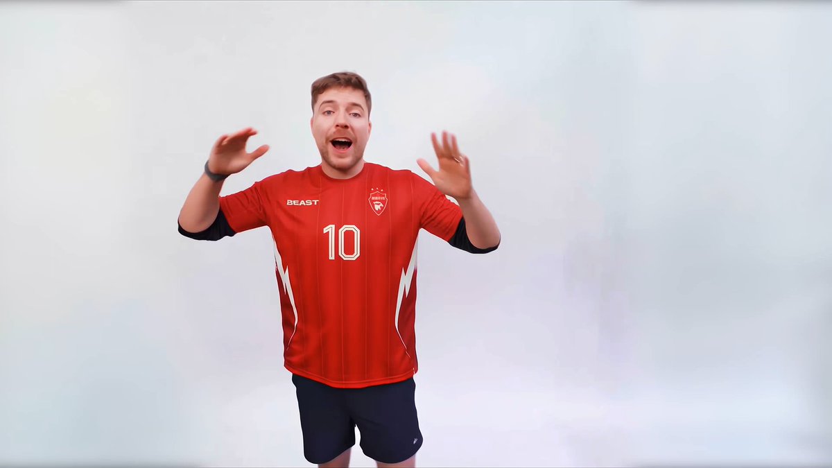
Shot 1 - 0:00
This is a great opening sentence simply because he establishes the entire premise of the video in a single sentence, and it instantly confirms the expectation of the viewer.
What's also great is that the stakes are already introduced through the sentence. So the viewer instantly knows what the video is about, having confirmed their expectation and having the premise set out very clearly.
There's nothing I can say about this. It's a great way to open a video.
However, while I think the wording is great, I do have a problem with the actual shot choice. The visual opening.
The opening shot only lasts about a second, which doesn't give the viewer enough time to connect with Jimmy as a person. From the perspective of the viewer, they're just seeing this flash of a person right there. And they're seeing that there is a presenter. But that's all this is really doing.
Now, it's not bad per se that we're opening with Jimmy, because this way we instantly establish that connection and familiarity with who is making the video. However, a better opening shot would have been Jimmy standing in front of a sports stadium or even next to multiple athletes.
Why?
Because we would instantly establish the concept of the video visually as well. Right now, we're just relying on the words to communicate the concept.
This would also allow us to stay on the shot a little bit longer and give the viewer more time to look at the shot so it doesn't feel visually jarring.
The problem isn't that we're opening on Jimmy. The problem is that we're not taking full advantage of what we could communicate visually while he's speaking to the audience.
0:01 - The first teaser
The next shot shows Jimmy shaking hands with an athlete. Now, even though this athlete is quite popular, it is LeBron James. We cannot fairly assume that every single person in the world within Jimmy's target audience is familiar with this athlete.
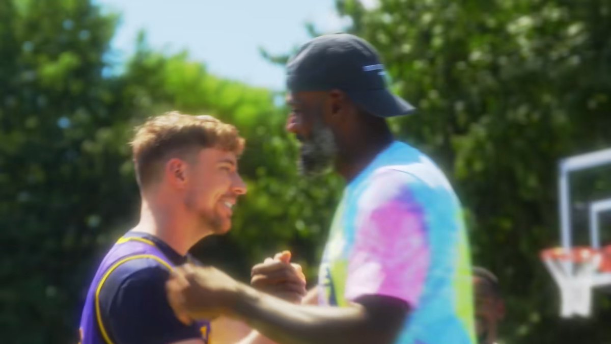
Shot 2 - 0:01
So, in order for a person to get excited about the shot, they need that recognition, which is something we've already established that we cannot rely on.
What we should actually be teasing here is the sport itself. Maybe instead of seeing the basketball player shake Jimmy's hand, we should see him dunk from very far away. And this way, no matter whether you know the athlete or not, you're still being targeted by the shot.
Now, this nuance doesn't seem like something I should be complaining about. However, I have worked on so many videos where I noticed people visibly tuning out of the video just because they didn't understand who the other person was, even though they were a very famous person. That's why I'd rather not take the risk and tease the objective value of the video rather than try to excite with something that could potentially alienate many people.
0:02 to 0:03 - Split screen teasers
Around this time, we have a split screen showing two people taking a shot with a football. The interesting thing here is that both sides are almost showing the exact same action. The only thing that differs is that on the left side, we see Haaland. And on the right side, we see Jimmy with Haaland behind him, and behind Haaland, there is a box with $100,000.
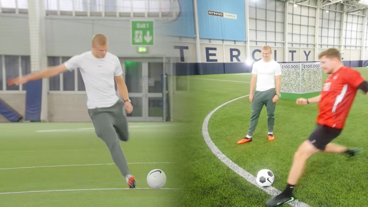
Shot 3 - 0:03
There's not really too much of a sense of contrast here. It's not like one side is visibly different from the other. It's just two people shooting at the same goal. So the only thing that the split screen is actually communicating is that we're challenging another person. It establishes a versus layout. And this is completely fine.
However, the real problem is that the split screen appears at the exact same time that Jimmy says $100,000 with his narration.
We have a mismatch between what is appearing on the screen and what is being said.
So if we're mentioning $100,000, I would much rather have a clear visual emphasizing the $100,000.
The versus layout, which, again, is not a bad layout, makes more sense whenever we're talking about the challenge itself and want to really double down on that one (which we already do later on). You'll see.
For example, we could have the athlete right next to the $100,000.
Practically, when I look at the shot, we can already see that one of the panels or one of the teasers that we're showing in the split screen is a shot that we could actually already choose. The right-hand panel already includes Jimmy, Haaland and the $100,000. It would just require us to make it full screen and then potentially zoom in towards $100,000, as it is a little bit in the background.
In general, what we are saying and what we're showing should be helping each other rather than competing for the same viewer’s attention. Since all of this is happening in a matter of a second, the viewer doesn't have a lot of time to decide where to pay attention.
0:04 - The baseball teaser
At 4 seconds, we have another shot of a guy batting towards the ball.
It's funny because at first I actually thought this was going to be cricket. since it seemed like a lower bat. But then, actually, I found out that it was baseball. And this is the perfect example of why shots should be shown for longer.
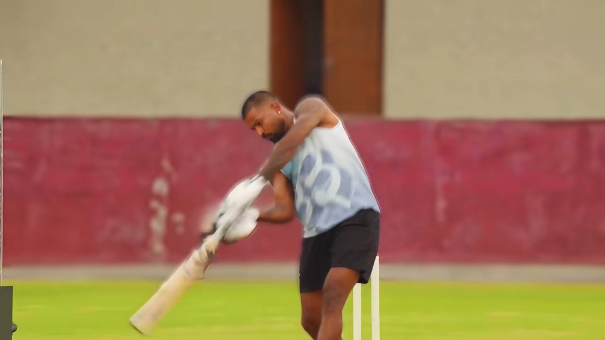
Shot 4 - 0:04
One second is not enough for me to be able to identify the sport perfectly. So when an audience isn't too familiar with the sport, shots like these require more time to process, and when you show it too fast, this could lead to people being confused. However, by 5 seconds, we do move on to the next shot already, and that brings us to one of the biggest problems I have with the intro.
0:00 to 0:05 - Too many complex shots
Within the first 5 seconds of the intro, we're showing 5 shots that are rather complex to look at. And I believe this is too much information in too little time.
The problem isn't necessarily the number of shots itself. The problem is that none of these shots are easy to interpret and naturally connect with the others. This all makes it so that it takes more thought and cognitive load to be able to interpret this one quickly.
We're also combining single shots with split screens.
We're also having wording that does not always match the visual.
And we also have every single transition from one shot to another including a flash transition.
The viewer is constantly being asked to reinterpret what they're looking at. Where should they look? Who is this person? What sport are they? What's the relationship between the two panels? How does this visually connect with what Jimmy is saying?
We're just asking so much information to be processed by the viewer in a very short period of time. And because the shots don't always support what's being said, we're not making that process any easier.
The way to think about this is that we're not really respecting the viewer's mind.
The shot lengths are not adhering to processing speed rules, which typically state that a simple shot should be shown for at least 0.5 to 1 second on screen, while a complex shot should be shown at least 1 to 3 seconds. Anything shorter than that one will lead to cognitive overload, which creates a jarring feeling.
Then the flash transitions are also making all of this a little bit more jarring because we're adding more stimuli to an already information-heavy sequence.
Do note: I know that a younger audience probably wouldn't be as upset about this one, and they can often handle a lot more information. At least as far as the current research is indicating. They're also generally more familiar with this type of fast editing.
But Jimmy isn't just trying to target this younger audience. He also wants an older audience, and for them, this intro could feel quite jarring.
To be extremely clear, I'm not saying that the fast editing is inherently bad. I mean, I've been part of his team, and I've asked for it too.
But I am arguing that the amount of time we're giving each shot should reflect how much information the viewer needs to process to avoid this whole intro from feeling so jarring (and to make sure that the viewer actually interprets what's being shown to them).
And in this intro, we're not doing this particularly well.
0:06 - LeBron James
When we move on to the intro, around 6 seconds, Jimmy mentions LeBron James.
Now, I actually like the fact that we're mentioning LeBron James. We're mentioning his name alongside mentioning basketball. And that specificity towards a person's name could actually create more curiosity and also feel like a stronger, more precise promise to the viewer that we actually got the right individuals for this video. We're establishing authority. We're not just claiming somebody is the best. We're mentioning somebody whose name already carries that association.
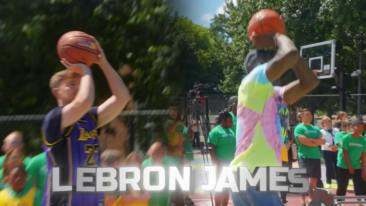
Shot 5 - 0:05
So I think the wording here is fine.
However, visually, we're showing LeBron James in a split screen alongside Jimmy. And this is where we have another problem. We cannot control where the viewer is going to look first. They might look at Jimmy first. But if Jimmy is mentioning LeBron James, we actually want their attention to go towards LeBron James. So a split screen isn't that good at this.
Because with a split screen, the viewer has to recognize that they need to shift their attention to both sides of the screen. We're essentially doing a coin flip here because they only have the amount of time needed to look at one side, because it's about a 1-second shot.
And the split screen is also equal, so the viewer doesn't understand, through sizing, shot difference, movement, or anything like that, where their attention should go.
The most interesting thing here is that we don't even need a split screen anymore. We've already established that Jimmy is challenging these athletes. If earlier on we would have just shown him in that single shot with Haaland, with the money in the back, that already indicates that they're challenging each other. We don't need to reestablish that through the visuals and the split screen.
At this point, I'd rather use the screen space to show LeBron James doing something exceptional in basketball. Because that would accomplish two things at once. It would reinforce who we're talking about and then also tease the actual content of the video.
0:07 to 0:08 - Alysa Liu
After LeBron James, we go into mentioning Alysa Liu in skating. Now this is where the problem with teasing names becomes a lot more obvious.
In the previous example with LeBron James, we're mentioning somebody who is incredibly recognizable, especially for a Westernized audience. The reason for this is because LeBron James has already made an appearance way beyond basketball. His name has also seen a constant stream of interest over the past 5 years.
However, with Alysa Liu, she has only seen a spike in interest towards her at the beginning of 2026. And that spike instantly went down to levels way closer to her notoriety before this interest. This is something we can check on Google Trends.
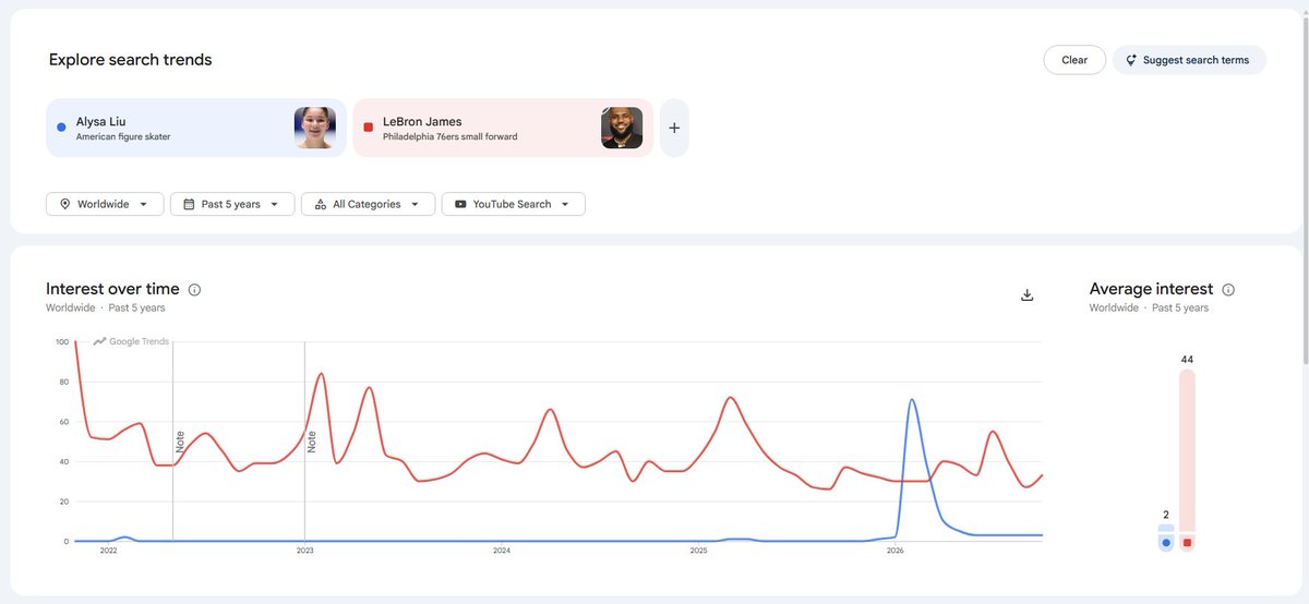
Google Trends Data - Alysa Liu (Blue) vs LeBron James (Red)
So by focusing so hard on her name, we're relying too much on the viewer being familiar with somebody who only had a temporary boost in popularity in order for that name to create excitement. That is a problem.
So instead of saying "Alysa Liu in skating," we should have probably said something like "the gold medalist in figure skating." Leave out the name.
Why?
Because now we're focusing on the achievement rather than the name itself. And the achievement is something that people are more familiar with.
It makes it so the viewer doesn't need to know who Alysa Liu is in order to understand why they should be impressed. We're just communicating that this person is exceptional within their sport.
There is something, however, that I do like about this particular visual teaser.
Unlike some of the other ones that we are teasing, Alysa Liu has one of the better shots in the intro. We're seeing her perform pirouettes, which, for most audiences, is something that looks generally impressive. And this is something that we exactly would want from these teasers.
So far, as well as in the future teasers, you'll notice everybody just taking a shot, but there's nothing visually impressive about that, while in this case we actually have a teaser that teases something exceptional.
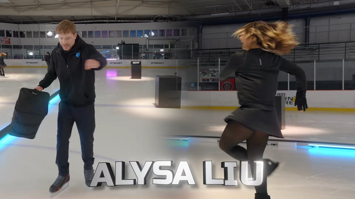
Shot 6 - 0:07
The improvement we can make here, especially with all of the teasers, is that they should be showing viewers why these people are exceptional rather than relying entirely on their names to communicate that idea.
0:09 - Simone Biles
After Alysa Liu, we go on to introduce Simone Biles as a world-class gymnast. Again, we have a few issues.
First is the wording. We're saying world-class gymnast Simone Biles. But being a world-class gymnast isn't as precise a claim as either stating the name of a person or highlighting an actual achievement, such as getting gold. We're just talking about the quality of who she is rather than an actual achievement, and if we do research into her, she is one of the most well-decorated gymnasts. This wording is definitely underplaying who she actually is.
But even with Simone, there is a familiarity issue with her name. I've already explained why teasing the name isn't that beneficial. But here, I want to double down, similar to Alysa’s comparison to LeBron James. Simone currently has less search interest than Alysa Liu when we're using Google Trends data.
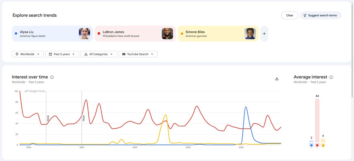
Google Trends Data - Alysa Liu (Blue) vs LeBron James (Red) vs Simone Biles (Yellow)
So we already know that the name, as well as how we're describing it here, is just not working well.
But then there's another issue, and the issue is looking at what she is actually doing. She's a world-class gymnast, but the problem is that we're just seeing her on a balance beam. Doing the most basic balancing. This takes away that visual promise we're looking for.
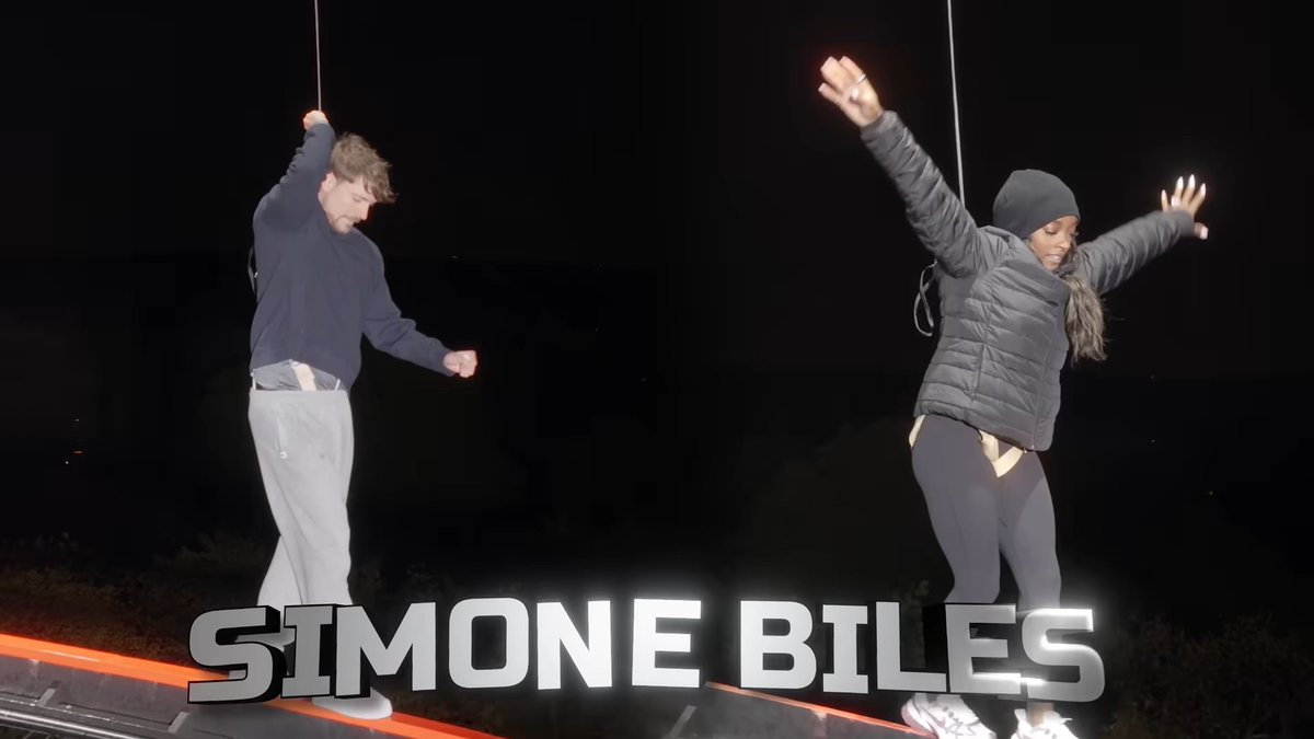
Shot 7 - 0:09
Now let's move on beyond the name and the visual impressiveness of who and what is happening.
There's another problem that occurs here, which is a more structural problem for the intro.
Simone becomes our third example in a list. And typically, when we're giving three examples, we want the third one to feel different from the previous two. It's the age-old rule of three.
Right now, we've just been listing athletes: LeBron James, Alysa Liu, Simone Biles. And we're grouping all three of them together, which makes the individual examples way less memorable.
What I would have done is something like: LeBron James in basketball, a gold medalist in figure skating, and one of the most unique gymnasts in the world.
Even the rhythm itself of the words is already creating some contrast and difference.
But then the real question comes: do we even need a third example?
I would actually argue that we probably don't need the third example because we're not really introducing anything that fundamentally changes the viewer's understanding of the premise with the third example. At this point, we've already established what the video is about, and we've already given two examples.
So rather than mentioning another athlete, I would actually probably go straight to the "and many more." This would instantly give us the opportunity to show a wider selection of challenges and all of the segments that we are about to show in the video.
A bigger problem with the available content
Now, when I started thinking about what we could show during the “and many more,” I went through the video looking for the other sports shown. We have already teased basketball. We've already teased figure skating. And we know that there is some balance beam work. However, while going through the rest of the video, I noticed there is also cooking in the video.
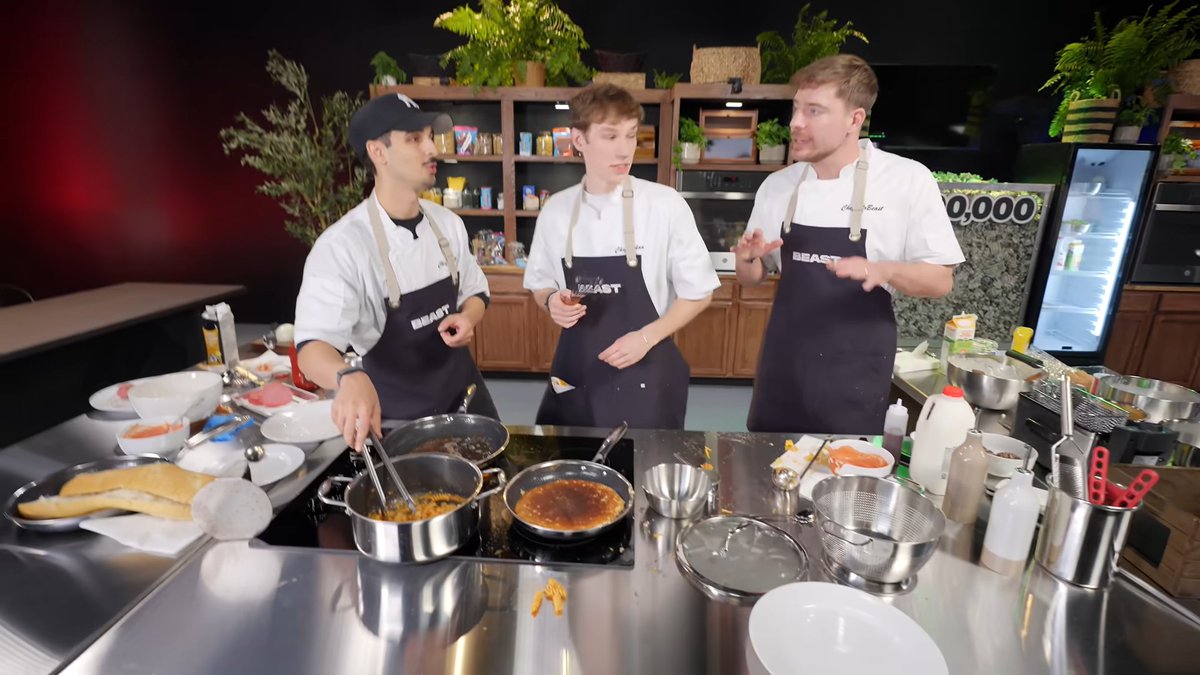
Reference later in the video
Cooking is not something we typically associate with athletes.
And it's interesting because it already suggests that there might be a mismatch between the expectation we're establishing in the intro and some of the content that appears later in the video. The good thing is that we don't tease this in the intro, but I thought it was something interesting to mention as I was doing research.
The viewer is being promised that Jimmy is challenging the greatest athletes in the world at sports, but now we're introducing something that doesn't necessarily fit that expectation. That's probably going to hurt the video.
I kept looking for other sports that we could use, but it doesn't seem like we have enough variety in the content to create a teaser that we want. So the many more in this case would just tease the balance beam and the baseball. A little underwhelming.
As we can see, the intro problem here goes beyond editing. Sometimes an intro reveals a problem within the actual content of the video.
We can improve the shot selection, the wording, and the pacing, but we cannot magically create a challenge that wasn't filmed.
For most creators, I would be okay with this one, but somebody like Jimmy (and having worked with Jimmy), I wouldn't find this acceptable. We could have easily added another sport in there so that we actually have many more.
0:10 to 0:11 - Repeated visual structure
All up until 10 seconds, we keep using split screens. The problem here is that we've already established that there is a battle between Jimmy and the athletes, so we don't need to keep showing that same relationship. Showing it once is completely fine.
But then, around 11 seconds, something confusing happens. When we tease the many more, we are using a split screen to tease them. However, it is the same type of split screen that we are using to show Jimmy competing against someone.
So now we're asking the viewer to reinterpret the visual. Because the split screen first means one thing, and now the same type of visual is supposed to communicate something else, that will create unnecessary confusion.
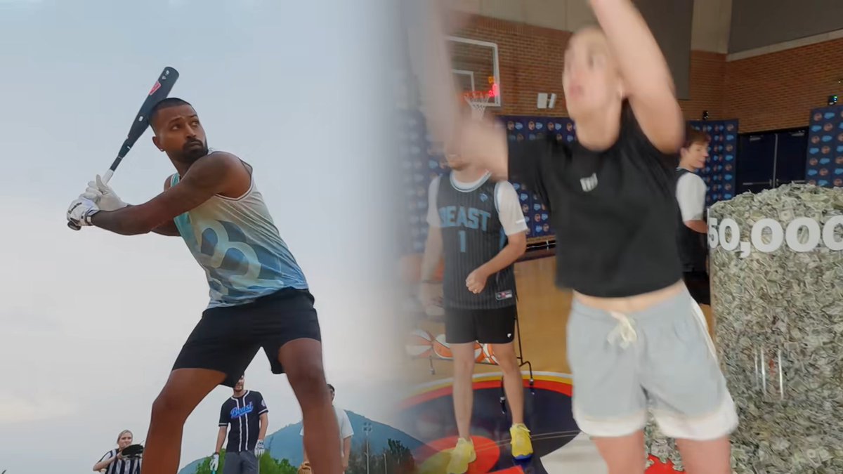
Shot 8 - 0:11
So what I would do instead is use a segmented overview showing all the sports and challenges that we're going to be looking at. That would accomplish something completely different from the previous split screens. It would give the viewer structural context.
0:12 to 0:13 - The intro length
There is one thing I want to give this intro credit for: the fact that the intro is only 13 seconds long. This is incredibly important. Because even though we've been showing a lot of information, using a lot of flash transitions, and making some visual choices that I personally disagree with, we are not asking the viewer to sit through this for very long.
If someone clicked on this video, they're probably still willing to sit through these 13 seconds without tuning out. Regardless of whether they are overstimulated or not.
And that's the main reason why I think this intro won't be the sole reason why this video succeeds or fails. But it's definitely a place that requires a lot of improvement.
Again, this doesn't mean that we should ignore the problem. I still think this is a very poorly edited intro. But there's a difference between saying that something is poorly executed and saying that it's necessarily going to cause a significant amount of viewers to leave. That distinction, I think, is important to make.
Looking at the intro as a whole
Now let's take a look at the broader structure of this intro, as we've already gone through the individual shots. When I'm analyzing an intro, there are four things I want to look at:
-
Are we confirming the viewer's expectation/setting a clear expectation?
-
Are we providing the essential context that the viewer may want or need?
-
Are we establishing a clear direction or goal?
-
Are we establishing the tone of the video?
And I actually think Jimmy is doing a pretty good job at covering these four things.
First of all, the confirmation is already there in the opening sentence. The viewer clicked on a video about Jimmy challenging world-class athletes, and that's exactly what Jimmy tells them this video is going to be about.
Next, the essential context is being provided through teaser clips. The essential context that the viewer may want is to know that you're actually going to deliver on this promise. And the structural context that they may need is to know that there are multiple sections. We're seeing different athletes, and we're seeing different challenges.
The goal or direction is already implied through its opening sentence, so we don't need to repeat that goal because the viewer already understands it.
Structurally, we're doing a pretty good job here.
But what about tone?
I think the music is actually exceptional. The music is exciting, and it really communicates that this video is going to be big, bombastic, and full of amazing things. We're doing a great job at setting a tone through sound.
However, sound is only one part of the equation because now we have to look at whether we're communicating that same tone through the visuals that we're showing.
And that's why I think the intro is much weaker.
We're already doing a good job by teasing somebody as recognizable as LeBron James. However, if we look at the actual actions we're showing, I think we're missing a lot of the opportunity for this intro.
With Haaland, one of the greatest football players, we're seeing Jimmy and Haaland take a shot at a goal. But we're not seeing how the shot lands, so we're not really showing anything exceptional.
It's the same with the baseball player. We're seeing someone bat towards the ball, but we don't see what happens next.
It's the same for LeBron James. We're seeing him throw a ball, but we're not actually really teasing the actual content. We're just seeing him do the action of throwing a ball.
We've got all these amazing players over here, but there's no shot that tells us, "Wow, that's impressive."
The only shot that actually does this is with Alysa Liu, where the teaser is the strongest because we see her perform a pirouette.
From the balance beam shots, when we tease Simone, we just see her maintain her balance. But when we look at the rest of the video and we skip to later, when it's actually her content, she is up in the air. There's wind, there's rain, and all that kind of stuff, and we're not teasing any of that. Why?
How I Would Rebuild Those 13 Seconds
As many of you know, I used to work on Jimmy's content quite a bit. If I look at the intros I've built back then, there's still a lot of things to improve on. But it's been many years, and in those past years, I've learned a lot about what makes for great intros. How would I personally improve this intro given all these issues?
0:00 - 0:03 - First of all, I would show Jimmy standing in a sports stadium or alongside several athletes, with $100,000 visually emphasized behind him. Even if Jimmy were to struggle to get those people on the same stage, we could use holograms to represent those players. I would also make sure that this entire sequence takes about 3 seconds rather than having 3 shots for 3 seconds.
0:03 - 0:05 - Next, I would show LeBron James performing a dunk, as we are stating the type of players that we're doing. During this shot, which takes at least 2 seconds, I would introduce the fact that we're using all these amazing athletes, and we're visually demonstrating the quality of the competition.
0:05 - 0:07 - After LeBron James, I would show Alysa Liu performing a pirouette. I would introduce her sport as an Olympic gold medalist in figure skating .
0:07 - 0:10 Then I would show the segment graphic that shows all of these sports, including the extra sports, and I would say, "and so much more." I would want to make sure that we're really showing the impressiveness of the baseball, the balance beam up in the air, and the soccer at the front. We could even put them in chronological order to indicate the ordering in the actual video.
0:10 - 0:13 - I would actually kind of shorten this intro with a few seconds here by zooming into one of the segments and then straight away going with “starting with”.
This would be a proposed editing direction rather than a finalized script, but it assumes that the necessary footage is available and that we can do this.
Final Thoughts
For a lot of people I know, this will seem overthought. But I really wanted to make this breakdown to showcase the amount of depth and thought that goes into an intro when you really want to perfect it.
Every single decision matters for some reason. Every choice you make can be good or bad for many reasons. Whether it's the visuals, the sound, what's being said, how long a shot stays on screen, or how one shot connects to the other, it's all important because it affects the way viewers consciously and subconsciously think about things.
If you're reading this from the perspective of a viewer, you may think that none of this matters. But to those who understand how every single one of these things can affect the viewer, it's easy to see how this intro is really bad.
沿着这个主题继续读
从一篇文章,找到相关的教程、经验和阅读路径。