Moodboarding at HEX
文章目录
部分视频或图片暂未收录,已在正文保留提示;需要时可查看原文。查看原文 ↗
A lot of moodboarding is just collecting design inspiration. You can build a Cosmos or Pinterest board, go digging for some similar visual references, and call it a direction. But what you’re really presenting is just that: references. Clients can use Pinterest and Cosmos themselves! If that’s all we’re doing in the “moodboarding phase” as brand designers, I think we’re wasting their time.
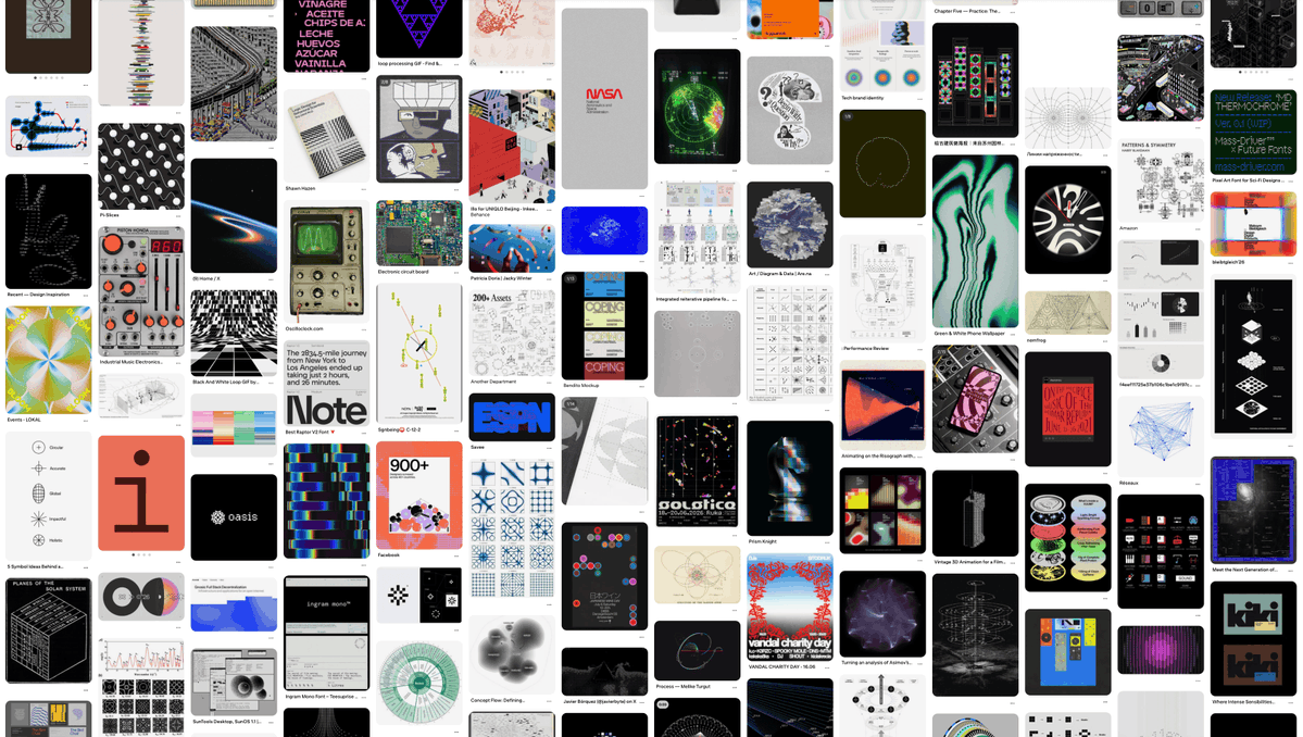
A curated Pinterest is not a moodboard
The best projects we’ve done at HEX have moodboards that are very specific and pointed. Instead of saying, “We’re exploring a playful direction for this company,” we’ll say, “We’re pitching Alice in Wonderland for you.” Then we explain why: maybe there’s a similarity to the product or an interesting visual connection. There’s an idea we can build a brand around.
We’ve started calling these brand angles. Angles give us something to explore besides “do we like these images?” They connect the company’s product to visual and comms strategy, but more importantly, how we make people *feel *what the company believes in.
A polished board can still have no vision
We’ve made concepts with nice typography, good spacing, polished layouts… the full gamut. But when you look at them, you’re left trying to build the story in your own head. Is this infrastructure? Networks? Integrations? Those ideas could apply to tons of our clients.
Writing fluffy copy like “a computational language for precise systems” or “a luminous system for data in motion” next to the images doesn’t solve that. The designer needs to ask,* what are we actually proposing for this company?*
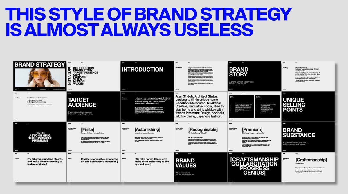
brand agency slop
The client is left deciding whether the board fits their visual taste. If they say yes, we got lucky. If they say no, we try ten more things. But we’re floundering, without some lighthouse bringing us back to shore. A good moodboard should give the client a vision they can recognize and respond to, even if they don’t like it.
Visual consistency isn’t a brand angle
I made this board in five minutes for this example. The images look really cool and are all relevant to one another, with black backgrounds, fine lines, grids, technical diagrams, big typography, etc. You can immediately see a visual style. That’s the trap.
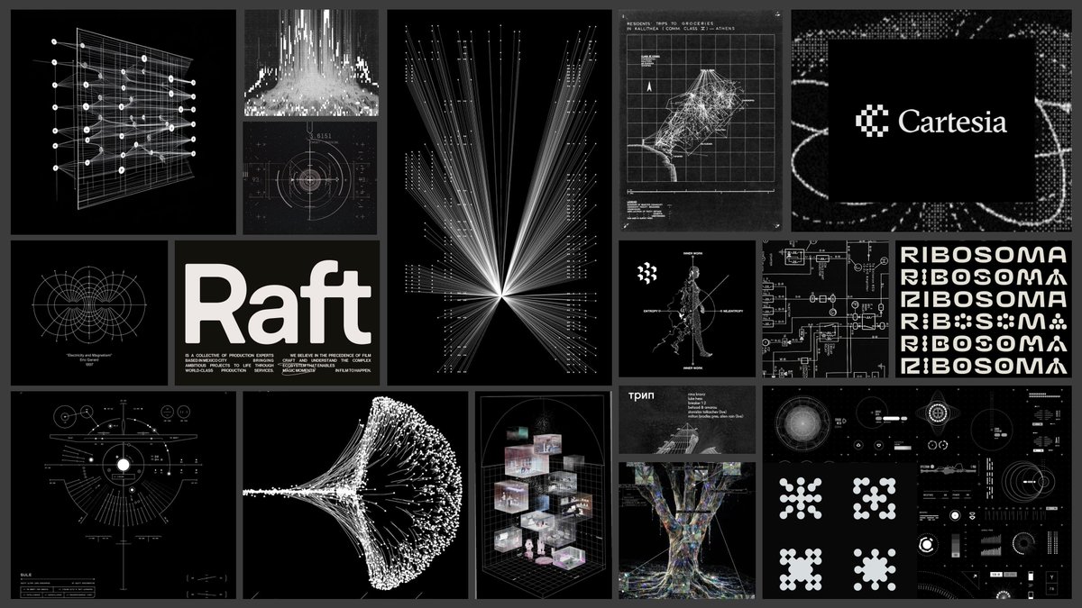
A deliberately generic moodboard, assembled for this example: cool images that relate to one another, without a company-specific idea.
There’s nothing wrong with the individual references. Each might make perfect sense in its original context. But putting them together doesn’t transfer that meaning to a new company. The board establishes a relationship between the images; it hasn’t established a relationship between those images and the business.
We’ve chosen how the company might look without deciding what we want anyone to understand or feel about it.
A much narrower board (even images from a single film) can give us more to work with when there’s a specific reason for choosing that world. Then the team has an idea to develop, and the client has an idea to react to. The missing work here is understanding the company well enough to make that connection.
Find the angle in the conversation
Everyone has a different definition of brand strategy. There’s the traditional agency route, where you make a big presentation, write big words, and give the brand a persona. The way we run strategy is through first principles: we try to learn as much as possible about the company, then start building angles.
The angle is never right in front of you. You need to go digging. A client can tell you who their customers are, how the technology works, and which brands they like, but we still have to ask the right questions and drill down into what *we *think is interesting about a particular company.
Sometimes that means going back through a conversation and finding one or two pockets of “oh, this could be cool.” A founder might say something that doesn’t sound like a design brief at all. Write it down. Come back to it when you’re exploring. If clients already had perfectly articulated thoughts and pointed visual ideas, they wouldn’t need us to do this part.
An invitation to fall down the rabbit hole
In one of our conversations with Dessn, the team talked about romanticism as an underexpressed emotion. They briefly pointed to Alice in Wonderland as a beautiful expression of it. That spark came from them, and we doubled down on it: how could that world of roaming freely and falling down rabbit holes become a direction for the brand?
That connected to the product. Dessn opens up design possibilities for people to explore. We could pitch that exploration as something exciting and delightful, rather than a place to get lost or overwhelmed. “Playful” on its own doesn’t tell us much. Alice in Wonderland gives us a world to think about.
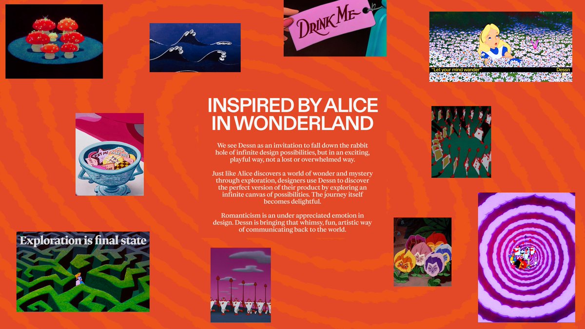
Dessn: The Alice in Wonderland angle connects the product’s possibilities to curiosity, exploration, and a world of wonder. Early moodboard.
The first concepts didn’t land. Some were too whimsical and playful; another direction felt crafty. The rabbit hole was the part that resonated. So we kept working on it: flower shapes, textures, more flower iterations, and eventually a wormhole that felt like things were falling into the middle.
Having a strong idea didn’t mean we got the execution right immediately, but it did give us something to keep coming back to. It gave us a lighthouse. There was much more to respond to than “we’re making a playful brand.” We could keep the part that meant something and push it further. The wormhole eventually became one part of a broader visual language.
Final Direction for Dessn
Build a visual language around a belief
Once we have an angle, collecting references becomes more purposeful. We should know what we’re pulling from each one. Maybe it’s a feeling or a way of visualizing information or an approach to color or movement. A few carefully chosen images can paint the vision. We don’t have to fill a fixed box with references just to make the board look complete.
Synaptrix: a visual language for the brain
The Synaptrix founder briefly mentioned how cool NASA was, and how there was no NASA for your brain. That passing remark inspired the whole direction.
Synaptrix is one of the clearest examples of what a strong belief can do for a brand. We pitched “Neural Universe”: the brain as a vast, explorable system, with Synaptrix as the interface that maps and navigates it. The reason for looking at space was very specific.
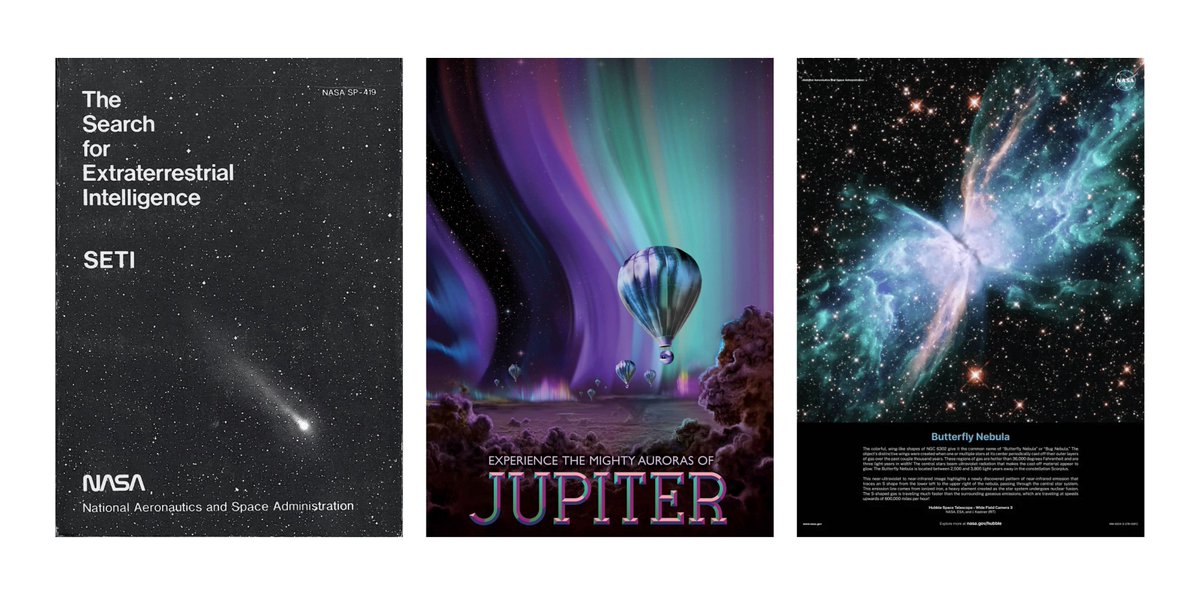
Poster Series by NASA
Space exploration has this beautiful visual language: NASA posters, galaxies, images you’d want to put on your bedroom wall. The founder explained that the brain is just as fascinating, beautiful, and complex as space. Why shouldn’t it have a visual language that makes people feel that way? We wanted people to want posters of neural connection visualizers on their walls.
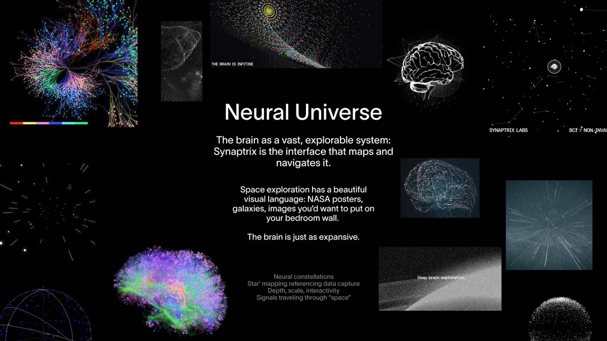
Synaptrix: Neural constellations, star mapping, depth, and signals traveling through space. The board proposes the brain as a vast, explorable system.
That is a much more rooted idea than “make this brain company look technical.” A network graphic could fit almost any technology company. Here, we’re asking people to look at the brain with the curiosity and wonder they bring to the cosmos. The references are trying to make them feel something while connecting the viewer back to a belief about the brand.
Star mapping can suggest data capture. Depth and scale can make the brain feel like a world to explore. Signals traveling through space can suggest the flow of information.
Brain wave visualizer
I feel like Synaptrix is one of our best works because we had that idea initially. It gets a lot easier to build cool, opinionated visual systems when we have beliefs we hold very strongly.
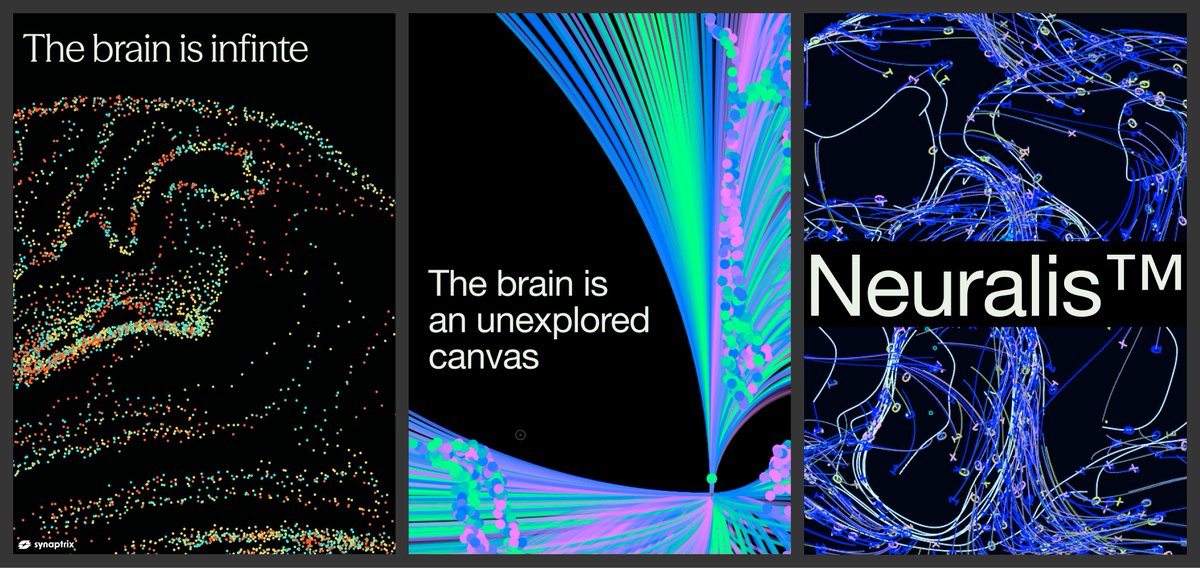
That’s also how we can tell whether the work is doing its job. A beautiful space graphic might still miss the point. The question is whether the visual language makes the brain itself feel as beautiful and fascinating as the cosmos.
Pitch a vision the client can respond to
Each angle you pitch should communicate a vision clearly enough that the client can tell us whether it excites them, scares them, or doesn’t resonate.
Explain it in your own words. A moodboard can have a lot of text or very little; there isn’t one required format. It should feel like it was written by a human who is pitching an idea. Just say what it is, how it is, and why it could be interesting for this company.
A passing remark is only a starting point. Our job is to turn it into a direction the client can respond to and the whole team can work toward.
Without a vision, we’re left deciding whether each execution looks cool, then trying again until we get lucky. But with one, feedback becomes useful context. We can keep asking questions and build on what starts to resonate. Even when an execution misses, we still have a belief worth working toward.